
The design decisions behind a real website transformation.
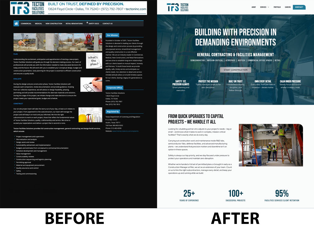
This website redesign case study looks at the design decisions behind the transformation, not just the finished result.
Most website redesigns focus on what changed.
I think it’s more interesting to look at the design decisions behind those changes.
People often assume a website redesign is mostly about making a site look more modern. In reality, the biggest improvements usually come from making information easier to understand.
Recently, I redesigned the website for Tecton, a safety-focused commercial construction company with expertise in critical building systems. They had decades of experience, a strong reputation, and an impressive portfolio of work.
But their website wasn’t communicating any of that.
The redesign became a great example of how thoughtful design can change the way people experience a business—without changing the business itself.
The Original Website Was Hard to Follow
Nothing on the original website was obviously broken.
The problem was that visitors had to work too hard.
There wasn’t a clear entry point. Headlines didn’t stand out. Sections blended together. Most of the content carried the same visual weight, making it difficult to know where to look first or what was most important.
As a visitor, you were doing the work instead of the website doing the work for you.
When everything looks equally important, nothing feels important.
Design Is About Guiding Attention
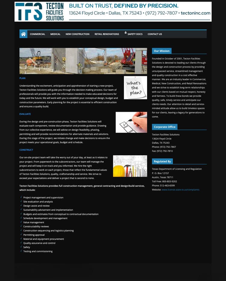
One of the biggest goals of the redesign was creating visual hierarchy.
Visual hierarchy is simply the process of helping visitors understand what to look at first, second, and third.
We restructured the pages so each section had a clear purpose and a logical place in the story. Headlines became more prominent. Content was grouped more intentionally. Spacing was used to separate ideas and create breathing room.
Instead of feeling like one long page, the site became a sequence of clearly defined sections that naturally guide visitors through the content.
Good design isn’t just about making something look better.
It’s about making it easier to understand.
Small Design Details Matter
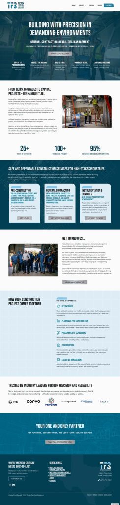
One of the subtle changes that made a surprising difference was the use of background graphics throughout the site.
These weren’t custom illustrations. They were stock graphic elements that I resized, recolored, and adapted to fit Tecton’s brand.
Used consistently, they help separate sections, create visual rhythm, and make the site feel cohesive.
Most visitors won’t consciously notice those details.
But they notice the result.
The site feels more intentional and more polished.
Here’s what I mean. Notice how the page now has a clear headline, breathing room, and subtle graphics that separate the content into recognizable sections.

The Biggest Difference: Showing the People Behind the Work
The original site had very few project photos and no images of the team.
That created a problem.
Visitors could see buildings, but they couldn’t see the people responsible for them.
Because photography has always been an important part of my process, I recommended a focused one-day photoshoot rather than a large production.
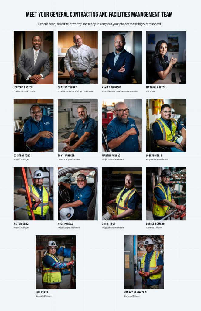
We spent a day capturing the team in their actual work environment—individual portraits, group photography, and action shots on-site.
In total, we created eighteen final images that could be used throughout the website.
Instead of only seeing completed projects, visitors could now see the people behind the work.
Before, you couldn’t tell who you’d be working with.
After, you could.
A Focused Approach
One thing I appreciate about this project is that it wasn’t a massive production.
The photography was completed in a single day at Tecton’s office and on an active jobsite. Rather than creating hundreds of images, we focused on capturing exactly what the website needed: team portraits, group photography, and authentic images of people doing the work.
The same philosophy guided the website redesign. Every design decision had a purpose—from the page structure and visual hierarchy to the background graphics and photography placement.

The Takeaway
The goal wasn’t to build a bigger website. It was to build a clearer one.
Tecton didn’t become more experienced.
They didn’t change what they do.
They didn’t add new services.
What changed was how their experience was presented.
Most websites already contain the right information.
The challenge is presenting that information in a way that makes it easy to understand, easy to follow, and easy to connect with.
That’s what I love about design. It doesn’t change the company—it changes how clearly people understand it.
When visitors don’t have to think about how to use a website, they’re naturally guided from one idea to the next. They quickly understand what a business does, who they’ll be working with, and how to take the next step.
That’s what thoughtful design accomplishes.