Goldberg & Associates Website Walkthrough
At Fresh Eggs, we believe a website should do more than just look good—it should tell a story that connects with real people. In this behind-the-scenes video, I walk through the redesign process for Robert M. Goldberg & Associates, an estate planning firm that wanted a site that reflected their values of trust, compassion, and care. You’ll see how we evaluated competitors, identified opportunities to stand out, and brought their story to life through design, photography, and structure.
Watch the full walkthrough below!

Transcript
Today, I’m walking you through our recent website redesign for Robert M. Goldberg & Associates. Goldberg & Associates is an estate planning firm led by one attorney. This project was about creating a site that truly reflects what the firm stands for.
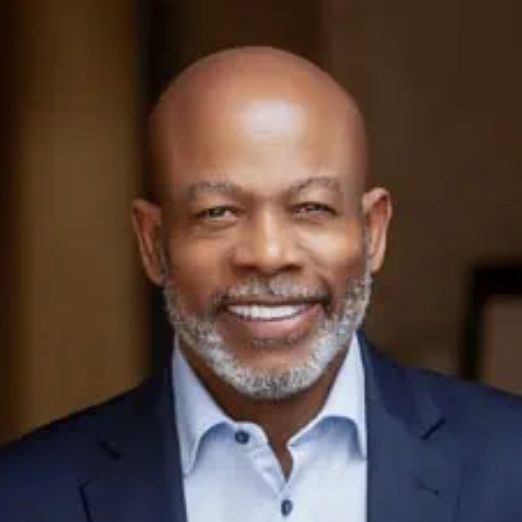
This is Bob Goldberg. He’s the solo attorney at his firm and has 8 staff. Goldberg & Associates wanted something that conveyed trust and compassion. The firm offers deep experience, but the old site didn’t communicate the warmth or clarity that sets them apart. To help with this, we reviewed local competitors to identify common visual and content patterns—and to find opportunities to stand out.
Competitor #1 is a larger firm with four attorneys. Competitor #2 is a single-attorney firm. Competitor #3 has two attorneys.
Competitor #1’s website feels a bit overwhelming—there’s a lot going on visually with a busy layout, rotating slides, and heavy use of stock photography. While they clearly showcase their experience, the site feels impersonal and a little dated, with a templated look. They do include testimonials on the homepage, but it’s just a feed from Google Reviews, which feels generic. They don’t have any case studies, and the font choices are basic.
Competitor #2’s site feels more personal but lacks polish, again relying heavily on stock photos. There are images and videos featuring the attorney, which helps personalize the experience, but overall the site feels inconsistent, with mixed quality in the photos. The firm’s logo is missing from all the subpages unless you scroll to the bottom, which is disorienting for users—it’s best practice to have the logo visible at the top for consistent branding. This firm also had no testimonials or case studies, and again, basic font choices.
Competitor #3 had the strongest site of the three. It was clean and user-friendly—but clean to the point of feeling somewhat plain and generic. There’s very little body copy to explain why you would want to click through deeper into the site. They invested in professional photography, but the photos weren’t leveraged as effectively as they could have been. For example, if they had varied wardrobes or switched up people in the shots during the same shoot, it would have given more variety. Instead, some images were reused frequently across pages, making the repetition very noticeable—especially with a bright teal shirt that stands out. Again, there were no testimonials, no case studies, and only basic font choices.
Goldberg & Associates’ original website had many of the same challenges. It used stock photos, repeated imagery, formal language, and lacked insight into the firm’s personality or the impact they make for clients. They had testimonials, but they were buried on a separate page—so users had to take an extra step to find them. They didn’t have any case studies either.
We set out to create a website that was more than a brochure. We wanted to tell a story—one that connects with people emotionally and highlights Goldberg & Associates’ real value in a professional, but approachable way.
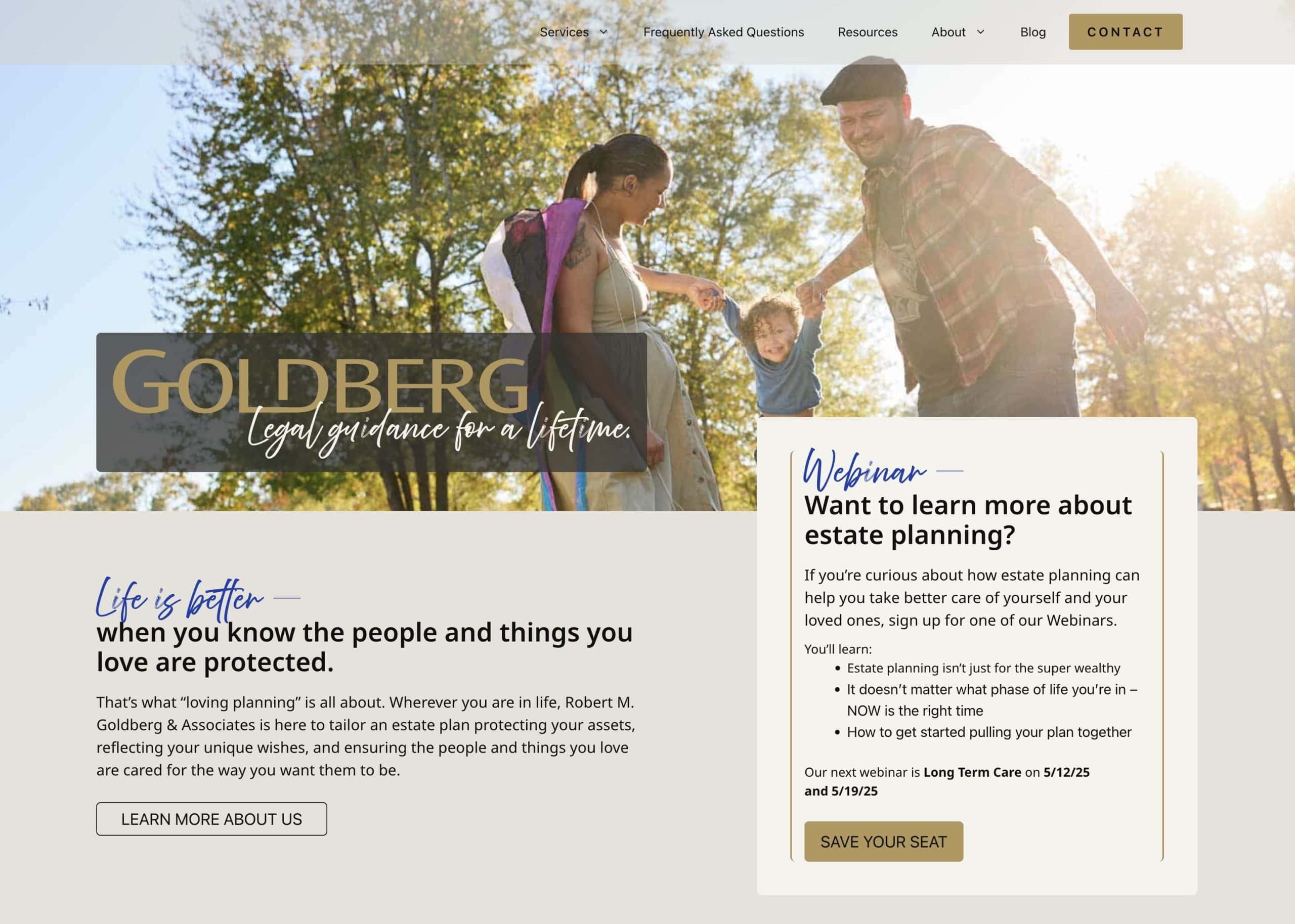
We did a full-day photo shoot with three real client families, capturing moments both inside the Goldberg office and in the clients’ everyday lives. These weren’t overly staged or polished—they were authentic glimpses into the lives of people who now feel more secure thanks to Goldberg & Associates’ help.
I created a warm color palette and reworked the logo, introducing a handwritten script font as an accent. It adds a personal, human touch. The clean sans-serif font paired with the script font keeps the look professional but friendly—just like Bob and his team. The handwritten script font is used subtly throughout the site for accents, reinforcing the personal feel without overwhelming the professionalism. Even the background isn’t a stark white—it’s a soft neutral tone that supports the warm, approachable visual story.
We also added client testimonials with photos at the bottom of every page, giving real social proof a human face. In addition, we included case studies on each service page, walking users through real examples of how Goldberg & Associates helps clients navigate important decisions. This builds both emotional and practical trust.
At the bottom of each service page, you’ll find summaries of the case studies and testimonial highlights. Each case study links to a fuller page with more details.
Here’s a look at the before and after of the homepage.
We went from cold, formal, and impersonal—to warm, welcoming, and client-focused.
The new site is clear, personal, and grounded in trust. It tells a story of security and care—not just through words, but through design, photography, and structure.
It’s not about the Goldberg office—it’s about the people the firm serves.
Most estate planning websites play it safe, but “safe” can often feel sterile. We wanted this site to feel alive—to truly reflect Goldberg & Associates: compassionate, competent, and real.
Here are the different service pages, and the rest of the main site structure.
Estate planning is deeply personal, and now the website reflects that. It helps visitors feel seen, supported, and secure—and gives Goldberg & Associates a brand experience that matches who they are and their mission of love planning.
End Transcript
A thoughtful website isn’t just about information—it’s about building an emotional connection. For Goldberg & Associates, that meant creating a site that feels personal, trustworthy, and truly reflective of the people they serve.
If you’re interested in creating a website that captures the heart of your business, let’s talk!